This article must be read by all students BEFORE choosing architecture universities, to understand what you should expect and not make same mistake like me!
My interest for architecture and real estate dates back from childhood, but most awesome work I done starting from 2008 (19 years old) when I made “Teoalida’s Virtual City” with dozens houses and apartment blocks, designed as hobby for graphic design and 3D modeling in AutoCAD, constantly improved to achieve most efficient and ergonomic layouts. Fascinated especially by public housing around the world, I imagined being president of a country or manager of a housing corporation, with mission to offer quality housing for at least half of population, like what does HDB in Singapore.
Most impressive is that all this experience I accumulated self-teaching, without any formal education. Despite of this, the “Virtual City” impressed many people, from random individuals dreaming to have a home, to architects and housing developers, who encouraged me to become a professional architect, saying that I can earn lots of $. In 2012 I started learning architecture, how to design construction drawings by laws, BUT…
Simply answering chats and emails, discuss project requirements to quote a price, is a waste of time if 90% never pay, only 10% have paid me and only after seeing (part of) work done. Once got paid, some customers were not satisfied or changed mind so I had to do changes (delaying me from doing other jobs) then I cannot sell same design to multiple people (like how I sell databases) because in architecture each customer have different requirements, making whole profession of architect a waste of time.
Website traffic rose from 100 visitors per day in 2012 to 1000 visitors per day in 2015, thus is more profitable to sell completed projects instead of making projects on request basis. Very few people buy floor plan drawings compared with IT companies buying databases.
Having a long-term collaboration with an established architecture company could have turned my life into a different direction, but did not had such chance until it was… TOO LATE.
Over years I met few architects with university degree and license, telling me that they have similar difficulties like me in convincing customers to pay, even after 20+ years experience they struggle to earn $2000/month, a sum that I personally achieved in 4 years of database business.
I realized that architecture does NOT suit me so I halted all studies and works. If customers request me new projects, I pass leads to other architects who do not have other jobs and can work whole month on a single house project, the agreement was to get 10% of payment to architect, but in most cases all what I get from architects are complaints for sending them non-serious customers.
This page shows designs done in my early years, to show you how my career in house design evolved. These designs may contain errors so I am not selling them. Latest and BEST designs, error-free can be viewed in House Design and Apartment Design pages, with editable AutoCAD DWG files available for sale.
The childhood
 How architecture popped in my life… remains a mystery even for me.
My dad was working in AutoCAD since 1995, when I was just 6 years old. I learned AutoCAD since age of 9 by watching him doing engineering drawings. Nobody in my family or friends been working in architecture or construction. I started designing my own buildings in 2001, when I was just 12 years old, without having internet connection or any help from friends, I had limited access to information.
In 2001-2003 my concept was to make buildings without concrete, with standardized metallic pieces like LEGO bricks, joined with screws and other things, to be able to build apartment blocks in several days and change internal layout everyday, also able to disassemble a house and move to another location. I designed concepts of both landed houses and high-rise apartment blocks, but all them were monotonous, drawings themselves were simple,, floor plans having only wall axis and door placement. Example: a 7-bedroom house designed in 2002 (photo).
Between 2005 and 2007 I gained some interest to study housing stock built from my country (Romania), been walking around my city and visited nearby cities too, and using internet I explored other cities from Eastern Bloc countries, I gained some architectural knowledge, I designed city maps and floor plans of many blocks built by former communist government (most of them are rectangular with 2 to 6 units per floor).
In 2007-2008 I practiced my urban planning talent in The Sims 2, where I built 3 cities with nice-looking but non-functional blocks.
In early 2008 I had a dream to design myself a fully functional city using AutoCAD, with 4 and 9 storeys blocks. I made several floor plans in Paint, most still inspired by Eastern European architecture, and several 3D experiments in AutoCAD. No finished project.
The early 2008 architectural designs
In mid-2008 I started exploring entire world using Google Earth, studying architecture of various cities, and make random searches on Google Images like “apartment floorplan“. I became fascinated by Asia housing where I found apartment buildings with one row of identical apartments placed along a balcony-corridor. Or crazy-shaped buildings with identical apartments mounted on a variable-shaped core.
I noticed the advantages of corridor-style: can create a variety of building shapes with variable number of units per floor without having rooms in middle of block without ventilation. No more limit to max 4 units per floor due to central staircase like in the previous european-communist designs.
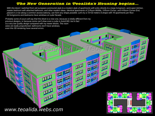
The New Generation in Teoalida’s Housing Design began! Completely different from my past designs inspired from Eastern Europe. Modern apartments with entry directly in a large living room, semi-open kitchen, one large common bath and one small bath for master bedroom, for the first time I include furnishing layout in my drawings.
The floor plan is based on a 4×4 meters grid, so overall it is nicely proportioned and versatile. Identical types of 2-Room Middle, 3-Room Corner, and 4-Room Corner End, placed in a row along a common access balcony, can form various block shapes that are 10 meters wide. All living rooms and bedrooms have windows on outer facade. A 4 roomer have a gross floor area of 128 square meters, exactly double than a 2 roomer. Net usable space is gross area minus 4 sq m (balcony) minus 12% (walls area).
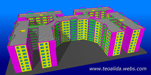
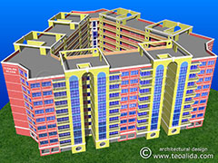
Let’s try a 72 by 32 meters S-shape with 16 units per floor on one single staircase:
Other projects included a square tower block with 4 units per floor, with 3 and 4 rooms, had advantage of windows for all bathrooms. Later was derived in a trapezoidal block. I also attempted a triangular block with 6 units per floor, but the 4-meter grid prevented me in making a good floor plan.
Maisonette Alternate – WEIRDEST block designed by me
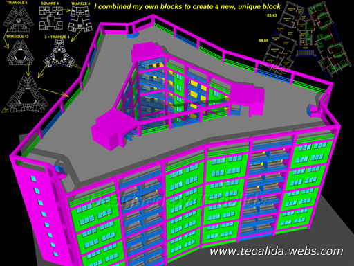
In August 2008 combined three ideas: double-storey 5-Room apartments inspired from Singapore maisonettes, external access corridors, and alternating (mirroring) the floorplan every two floors, to create the weirdest project in my career. Despite of crazy-looking with weird layout of windows, is fully functional, on each floor 2 apartments shares a single pipe column for kitchens and bathrooms, but the layout is not efficient (los of space space is wasted). When I published on website in 2019 I named it “Maisonette Alternate” and redesigned in Trident shape for a surplus of craziness.
Tritrapeze
In September 2008 I tried again to design a triangular block, but with 12 units per floor and 3 staircases. In fact, I merged three Trapezoid blocks around a central courtyard, to create another weird shaped building. Two different types of 3-Room, closed kitchens with blocked views, service balconies at kitchens (for the first time), but no windows for bathrooms.
Little & Simple
Meantime, I concentrated on improving my first project, I criticized myself for incorrect flat size proportions, 2-room having just half of 4-room size. I tried to design other versions with block width increased to 12 meters.
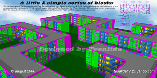
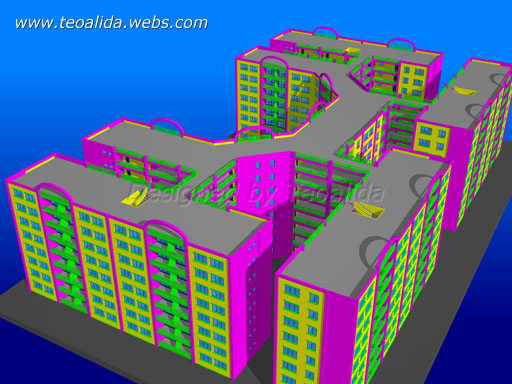
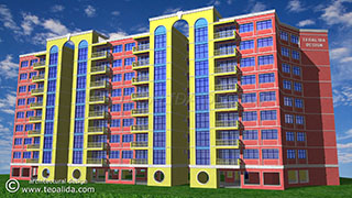
So in September 2008 I launched the successor, called Little & Simple. Three standard versions: I-4 (32 by 12 meters), L-6 (36×26 meters), U-8 (40 by 26 meters), can be joined to form various shapes, for example a S-36 (36 units per floor) in 132 by 52 meters, pictured here. Due the block layout, the two-room units always represented 50% of total number of units.
Designed as walk-up block, staircase integrated inside, open kitchen design and better relation between flats gross floor area: 2-Room Middle (70/72 sq m), 3-Room End (96 sq m), 4-Room Corner (120 sq m).
Regulated facades for enhanced aesthetics
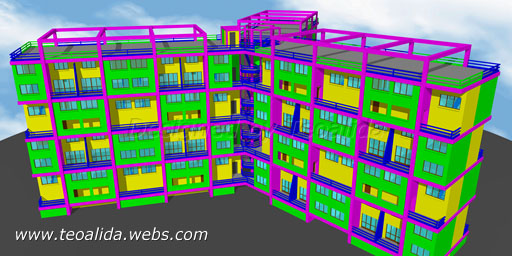
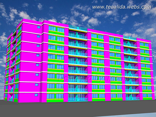
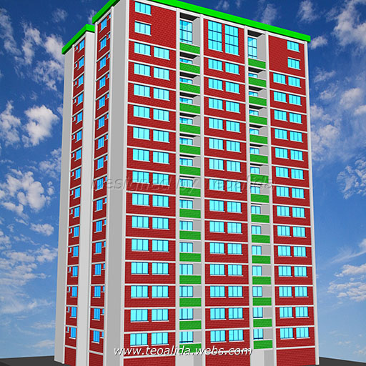
I carefully calculated everything to create nice visual proportions in facade design in AutoCAD 3D renderings. Floor plan follow a 4-meter grid, and by having 4 meters frontage for each room and 3-meters floor-to-floor, a nice 4:3 ratio was created. Windows height is 1.5 m and width 1.5 meters for kitchens, 2.5 meters for bedrooms, and 3.5 meters for livingroom-balcony. Bedroom windows are grouped two with two, separated by a 0.5 meters wall, 0.5 meters cornices are also at basement and roof level, leaving 1.5 meters vertical space between windows, 1 meters of horizontal and vertical space between windows and columns / cornices.
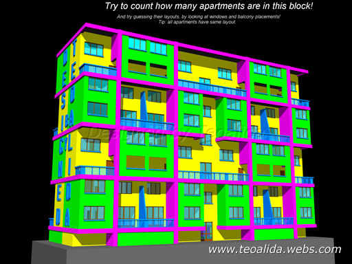
The color scheme was chosen for maximum contrast rather than realism. For windows I choose cyan because reflects the sky, the small elements like windows sills or balcony frame and glass were cyan-blue, and yellow for wall inside balcony to be in contrast, the external walls used the remained light color: green, while for columns and beams I used magenta to be in contrast with green. Later I made balcony door full-width and and yellow color moved to external walls.
Other projects
I designed few more projects, at least sketched (wall axis). Some did not followed the 4-meter grid rule and had dimensions with decimals. Some were influenced by Eastern European apartments, with entry to a central hallway rather than to living room (what a waste of space!), some were influenced by Japanese apartments, with one bath per apartment but separate toilet and shower, some were influenced by South Korea, China, or Hong Kong… But the 4-meter grid-based designs proved that are still the best!
The late 2008 development boom
After researching architecture from countries like Singapore, Japan, South Korea, China, and Hong Kong, I recognized Singapore as the best city of the world, mainly because of being masterplanned city and the public housing programme from HDB that houses 80% of population. So I choose to follow Singapore typologies and lifestyle of HDB flats.
The average apartment size should be around 100 square meters, 4-Room should be dominant, hallways must be reduced at the minimum, even eliminated, the living room may be placed centrally, and every bath should have window for ventilation. Also I decided to make all bathrooms with bathtub (stupid rule). This caused a boom of new projects for the next 3 months.
New Generation
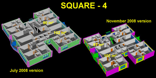
I improved again my first modern project and re-launched on October 2008 as “New Generation”, 12 meters width, now 3-Room and 4-Room were dominant, staircase is well integrated inside block, external glass lifts. Larger apartments with kitchen closed (but easy to be opened to living). The first version still lacked bathroom ventilation, but I adapted it to new rules in November 2008, but the 4-Room Corner (105 sqm), became badly shaped, so I tried several reshaping until in December when I decided to use for Corner same apartment type 4-Room End (115 sqm).
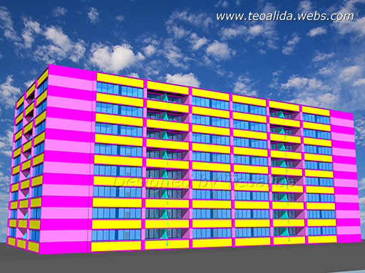
For the first version I made 3D design with horizontal lines and full-width windows (left photo). I had a dream several days before with a block with horizontally continuous windows that made me to love this design for a moment, but after consulting with friends I realized that it is ugly, so I switched to more regular design like the one seen in Little & Simple (lower photos). In December 2008 I experimented a new facade design (right photo), inspired by some 1990s blocks from Singapore (Taman Jurong blocks).
Beside the standard versions (I-4, L-6, U-8), in November 2008 was also designed a crazy version with 26 units per floor on 4 staircases (lower photos). The 3D design is incomplete, missing ground floor and lifts.
In fact, this was first block I named New Generation, and a naming system was born: Model – Shape – Number of units per floor. Previous, all projects were considered “The New Generation of Housing” and were named only by shape and dimensions, for example U-block 64×24, S-block 72×32, Square block 24×24.
Other projects November 2008
Square Small – 4 adapted easily to the new rules, can have 2 versions, one with four 3-Room and one with two 4-Room on one half.
Little & Simple cannot be adapted to the new rules, so I returned to its own predecessor, now called New Generation Narrow, only 10 meters width, improved with windows at all bathrooms.
Trapeze – 6, a tower block with non-equal wings, 3- and 4-Room apartments developed by mixing the horrible Trapeze – 4 with the never-finished Triangle – 6 that will had only 4-Room apartments.
Other projects December 2008
Old Generation, designed in classic asian style with living room facing common corridor, block width 14 meters, 8-meter width 3-Room apartments, bathrooms on airwells, and 4-Room apartments on endings. Was simple, very ugly monotonous facades, and had a lot of problems. But the land usage efficiency was good.
Polygons where somewhat circular blocks with internal courtyard and unfortunately had only 4-Room apartments.
Zig-Zag Large – 4 and Rectangle Small – 4, tower blocks with only 4-Room apartments but one room is smaller than a regular bedroom, like a study room.
Square Large – 4, was inspired by the 25-storey point blocks built in Singapore between 1970 and 1985, I designed it as soon as I saw a floor plan of these blocks, it was my first block with real 5-Room (4 bedrooms) regular apartments (non-penthouse). .
Other projects January 2009
Rectangle Large – 4 had the biggest apartments, separate living and dining plus three bedrooms.
Triangle Small – 9, my first symmetrical block with odd number of apartments per floor.
Later I derived it into a Triangle Small – 12 and a Triangle Large – 12.
A new Maisonette Generation was designed.
The era was closed with this AutoCAD 3D masterpiece (February 2009)
The 2009 high quality housing design
Researching Singapore housing deeper made me to realize that my projects were badly designed. Too thick walls, too big apartments which will become even bigger with thinner walls. I need to design new apartments with smaller but more rooms. I imagine families with 2 parents and 1 children could not afford a New Generation 3-Room apartment (87 sqm net, 96 sqm gross, which is average size for 4-room in Singapore), some families of 3 people wants 4 rooms, one extra room for study.
I started to review every rule, and in March 2009 I finalized a full set of new basic rules for ideal housing. The biggest changes were: I eliminated 4-meter grid to allow more variable room sizes, master bedroom must “grow” like living room, depending of number of rooms, common bedrooms will be better to be 3 by 5 meters rather than 4 by 4 meters, to reduce space used on facade, the 3-Room apartments can have common bathroom with shower. Walls must be 1/8 meters thick.
I created a new AutoCAD color scheme in January 2009, used also on late 2008 projects, and with constant improvements, on all 2009 projects. The color scheme was inspired by Singapore 1990s designs: red, orange or yellow brick walls, with white horizontal stripes. Again, colors create contrast with the blue sky and windows.
I started my website teoalida.webs.com in April 2009 and published my architectural designs on internet for first time.
Old Generation and New Generation series
I started thinking how inefficient is if even the smaller 3-Room apartments in New Generation Narrow use 12 meters frontage on both sides, because of the stupid 4-meter grid. I really need to design new blocks, wider blocks with shorter apartments, with narrow rooms! Also I found that in Singapore apartments with rooms facing to common corridor are not hated as I previously thought.
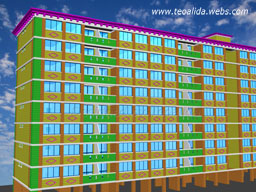 So… in March 2009 I started development of 2 new projects (my concepts, not based on any existing block in the world), both 12-meter width:
Old Generation (renamed to Linear Small) living rooms facing to access corridor, is based on the 9-meter length 76.70 sqm 3-Room, with 4-Room on the endings. 6-meter length 46.70 sqm 2-Room were also designed (right photo, facade design partially inspired by Tampines block 497).
New Generation (renamed to Linear Large) living rooms facing opposite to access corridor, is based on the 12-meters length 104.20 sqm 4-Room, but can have many apartments types, ranging from 84 sqm 3-Room to 133 sqm 5-Room, slanted apartments for non-90 degree blocks.
I redesigned original Old Generation from November 2008 in a more nice shape, block narrowed to shrink apartments sizes, airwells eliminated and bathroom moved to facades, but I still did not liked it.
Sharpback series
Old Generation Sharpback was designed in June 2009, 14 meter block width, 7-meter length 3-Room apartments (renamed as Corridor 3/4-room). Based on the most common block type in Singapore’s 1970s and 1980s. The previous Old Generation was scraped because have no advantages compared with Old Generation Sharpback. A larger version with 4-Room 11-meters length apartments was also designed, but quickly scraped because of many disadvantages compared with 4-Room 12-meters length apartments in New Generation, in 2010 I added it back in lineup.
Hexagon Concave Tower
 Designed in March 2009, with 6 apartments per floor which had some similarity with Rectangle Small, this block may be my WORST design. Problems: too small staircase/lift lobby, no ventilation, unaligned walls which do not allow a solid core, and odd living room shape.
Triangle Tower
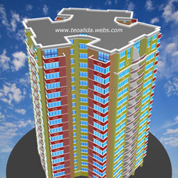 After almost 1 year from original idea, I finally designed Triangle Tower in May 2009. The key of success was reducing bedrooms size to 3 by 4.5 meters and pushing bathrooms towards living room. The photo on right shows the original design before July facelift (current design in Apartment Design page). Hexagon Concave was trashed.
Rest of projects
Rectangle Small, Square Large, Trapeze, Triangle Small / Large, were more or less redesigned and adapted to the new rules.
Squares Tower which dates back from December 2008 was redesigned, it is also based on Singapore old blocks.
Polygons, Rectangle Large, Zig-Zag Large were completely scraped.
Zig-Zag Small was developed by mixing 3-Room apartments from Trapeze Tower with the shape of Rectangle Small. Is similar with the previous Square Small which was scraped.
Two new towers, Square Small and Square Large were designed in May 2009, based on my New Generation.
Segmented Generation was designed in June 2009, based on Singapore’s 1970s blocks.
The high appreciation of Triangle Tower within my circle of friends, leaded to development of a new project called Freedom Generation in late 2009, renamed to Freestyle)
New naming system
I had 14 finished block models, of which 7 contains Generation (I named in this manner all blocks with variable (non-fixed) shape. Clearly too many and confusing! New names proposed:
Old Generation > Linear Small
New Generation > Linear Large
Maisonette Generation > Linear Maisonette
Unnamed Generation > Linear Studios
Old Generation Sharpback > Sharpback Small
Segmented Generation > Segmented
Freedom Generation > Freestyle
Sharpback Large and Sharpback Maisonette were also designed but not published considering them bad designs.
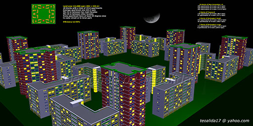
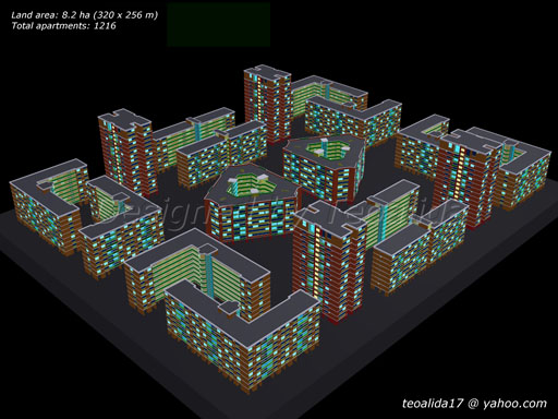
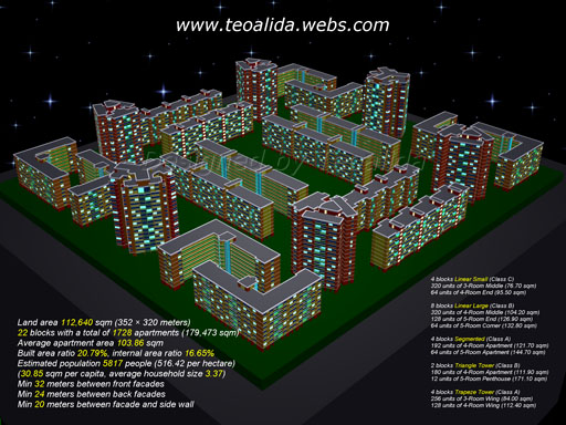
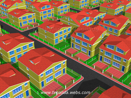
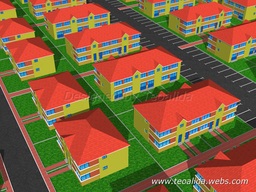
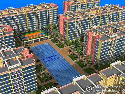
As being closer to perfection, the evolution inevitable slowed down. I had in plan to design a BIG CITY of about 1 square kilometre, with streets and some landscape, streets based on a REAL city, but this is a hard mission and would take a lot of time. Until I do it, enjoy rectangular symmetrical neighborhoods such as below ones (made in late 2009). Other events in my life made me to spent less time designing new 3D buildings in AutoCAD for fun.
The 2010-2011 diversity, inspired from multiple countries
During 2010 I paid little attention in designing new apartment buildings, but in the second half of year I started to design landed houses. I studied many other cities from different parts of world, to make diversity both in floorplan and facade design.
An iconic project, CentralLiving was designed in November 2010, own concept with no inspiration from anywhere.
I spent first 3 months of 2011 studying Hong Kong tiny apartments, to create my own series of 6 Hong Kong-inspired projects, but finally I designed 8 projects. Who the fuck needs a 100 sqm apartment? Hong Kong proved that with good planning design, a family of 4 can live comfortable in a 60 sqm 4-room apartment.
Google launched StreetView in Brazil in late 2010 and this leaded to a high interest to study Brazil real estate, I had interest for Brazil before too, I love how floorplans are made with dimensions, apartments itself are quite small but moviing from houses to apartment towers is seen as a symbol of progress in Brazil.
But I will never stop loving and studying Singapore! It remain the best city in the world!
During 2011 I designed numerous new projects, I realized that my apartments are still too big so the 2011 ones were again downsized, common sizes now are 70 sqm 3-room, 95 sqm 4-room, 120 sqm 5-room. This sizes were not a premiere, I had 95 sqm 4-room since 2009 (check Linear Small).
New rules: 3×4 m bedrooms (rather than 3×5 m or 3×4.5 m), while for master bedroom the minimal size is 3×5 m for 3-room and 3.5×5 m for 4-room (rather than 4×5 m), because these are common sizes in developed countries (I saw some cases of bedrooms small as 2.5×3 m in Western Europe, but I decided to not downsize further my international series).
Beside international series, I designed also a series of low-cost apartment blocks, inspired from Latin America, with sizes suitable for developing countries.
CentralLiving, original design from November 2010, and The Harmony, one of the 8 projects inspired from Hong Kong, designed in March 2011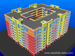
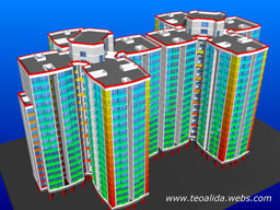
The 2010-2011 expansion to Landed Housing design
I was imagining since 2009 that one day I will design landed houses too, but my experience was only for apartments.
In 2010 I started studying landed houses of Singapore (previously I paid attention only to HDB blocks) and I designed my first project, Terrace Housing, having 6 m width and 14 m depth for first 2 floors and a 3rd attic-style floor. 5 bedrooms, three en-suite bathrooms and one common bathroom which lacked window.
Then I realized that if I eliminate one bedroom I can have windows for all bathrooms, even more, I can provide all bedrooms with walk-in wardrobe and en-suite bathroom. The floorplan was reduced to 13 m depth, 3 full floors plus basement parking, becoming the “Terrace Classic” project.
The original 14-meter depth Terrace became the “Semi-Detached” project, with 5 bedrooms, shown here:
Soon I feel the need of diversity, and I studied the opportunity to add a lift. I had 2 floorplans, one 12 m depth space-optimized and one 13 m depth which allows lift, and 2 possible design themes, the already-made Neoclassic one with 3 floors and sloped roof, and I also wanted a Modern one with roof terrace on 4th floor.
Dilemma: which 3D theme to use for each of these floorplans? Theoretically the 4-floor design should have the floorplan with lift, but that floorplan did not allowed any room on 4th floor due to lift, being placed on opposite side of stairs, I did not like to have the lift serving only 3 floors.
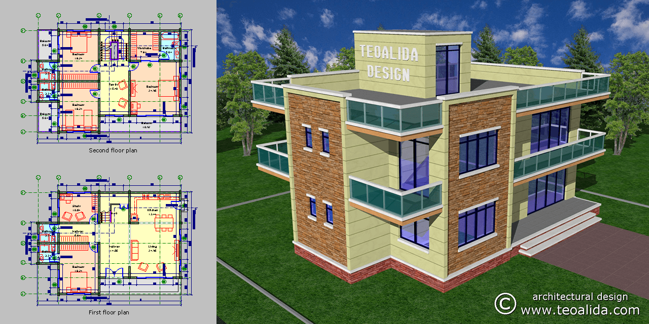
Solution: I lengthen the house depth with 2 m (to 15 m) and I placed the lift on same side with stairs. The floorplan was finalized, but the Modern 3D theme was very ugly in my opinion, since I love classic styles (I insisted to design something against my tastes), I played a lot with color schemes and textures until… I finally published Terrace Modern on February 2011, and surprisingly, it became most viewed image by website visitors.
I added lift in Terrace Classic too, and redesigned 3D design in the form of a condo-style complex of 80 houses and shared pool (photos of original Terrace Classic to be added).
Terrace Classic vs Terrace Modern housing, two projects inspired from Singapore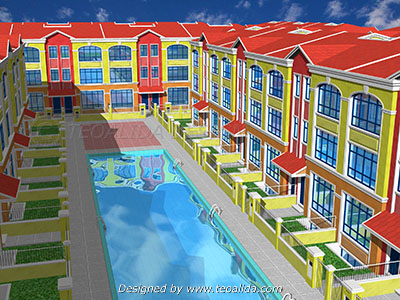
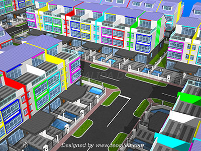
After this, I designed few additional landed housing complexes inspired from other countries of the world. This was the chronology:
July 2010 – Semi-Detached, inspired from nowhere; Terrace Classic, luxury housing inspired from Singapore.
August 2010 – Quadruplex-Terraced, inspired from Europe / United Kingdom.
November 2010 – Terrace Airwells, another medium-luxury housing, typical in Malaysia but using Singapore rules.
December 2010 – High-Density, low cost housing inspired from Mexico.
February 2011 – Terrace Modern, luxury housing inspired from Singapore.
Quarter-Detached, was planned for March 2011 but abandoned due to ugliness.
And the list continue in 2012…
Continue reading and see 2012 projects in Apartment Design and House Design pages!
(all projects posted on this page are deleted from current apartment and house design lineup)
2012 – architecture hobby turned into business
In 2011 one of my friends asked me a house design, you can see it posted in House Design page as Split-Level house. So I announced that I offer design services to everyone.
The real SUCCESS came after I found chat software in January 2012. I started being contacted by people from various countries. Initially I did not know how to deal with them to turn into customers, but this gave me motivation to learn more.
The lack of customers in 2008-2011 was because of unclear introduction of website. I got comments like “Thank, great collection of plans” or questions like “Do you also design houses?” and “Wow these houses are designed by you?“. Conclusion: people confused my PERSONAL website with the numerous architecture websites who just collect photos and house plans found on internet and do not offer services, example ArchDaily. Even worse, my contact info and services offered were on Home page, but people landed from Google in House Design page where it was not clearly stated that I can offer design services for customers.
In early 2012 I was not confident that I can make customers happy, thus I did not charged money for designing floor plans that took max 1 hour, my strategy was to ask payment for 3D design which would take few hours, but nobody was interested in 3D design, people were thankful for floor plan. I did not complain for not earning money, because I earned knowledge about foreign countries, that will be helpful to offer better services.
Some customers told me that real architects do not even say a word without getting paid first. So, after several happy customers, I started charging money for floor plans too. Most people said “thanks, I have no money”. Later I realized that most people contacting me were actually STUDENTS, NOT profit-making house builders. Sadly, beside these students, been contacted also by a builder of terraced houses, he could be my first real customer but I treat him like students, making a simple sketch without attempting to charge him money and make detailed drawings.
First collaboration offer
In June 2012, an architect said that my house designs are impressive for my age, offered me to advertise my services on his website, a directory of architects (caribbeanhomeandhouse.com – site closed 2023). This was like WTF, I don’t have any degree in architecture! I was promoting myself as “graphic design & 3D rendering services“, he suggested to change into “architecture design services“.
I accepted thinking that he will help me starting a professional career in architecture. But actually he was an idiot and put me on wrong track, into a career that I NEVER enjoyed.
What I was doing was a hobby, 3D art in AutoCAD, concept drawings NOT made for submission to government for building permit or contractors. I was aware that, to build a house you will need higher-detailed “construction drawings” but I knew nothing about them because I never intended to provide “construction drawings”. I was charging $20 for 1-hour floor plan. He suggested me to charge 5% of home value, so if house cost $200,000 should charge $10,000+ per project, but he never informed me what drawings do I need to provide for $10,000, he misleaded me that the concept floor plans done in 1 hour are enough to build a house (read full story).
Meeting more architects and choose my business strategy
In late 2012, I meet more architects from Singapore, Malaysia, Philippines and India, telling me to price concept drawings (sketches) and construction drawings accordingly. I started learning how to make “construction drawings” to be able to offer real “architecture services“.
I returned to the strategy used before meeting Caribbean architect: offer the first sketch for FREE in PNG format to prove ability of making nice floor plans, then negotiate price for construction drawings, or sell the sketch in PDF / DWG format. Price for construction drawings: $2 per sqm which raised complaints from Indians who build big but cheap houses, so in 2013 changed to $50 × number of rooms. First paying customer came in late 2012.
Moving from teoalida.webs.com to teoalida.com in December 2012 and further improvements in website design promoted trust and seriousness, more house builders looking for architects started contacting me, not just students looking for free concept plans. I met also architects to collaborate with, in case my customers wants drawing signed by a licensed architect. However most customers choose to find themselves an architect in their country to sign the designs got online from me, or just build without permit (in third-world countries illegal construction is common).
The chat software also helped me to understand business potential of another hobby, the Car Database, so In mid-2012 I decided to stop designing the “Virtual City” for hobby / artistic purposes, and concentrate on designing buildings for customers, as well as transforming my hobby of researching car industry into a product usable for companies.
2015 – retire from architecture
Between 2012 and 2015 I made HAPPY hundreds of customers. Mostly families building their own home, mostly in third-world countries. I had few partner architects, but they were not needed, my drawings were professional-looking enough to get building permit (in third-world countries authorities approve any drawing). Even if I never been to university, my imagination was impressive, several university-graduated architects asked me for advices or concept plans as they did not had imagination to make themselves.
But one person was NOT HAPPY… that was ME! Because of difficulties convincing customers to pay. Out of total people contacting me, 90% never paid, ONLY 10% paid me and ONLY after seeing (part of) work done.
The paying customers, paid me because I impressed them with “first sketch” designed for FREE. Customers served with free sketches returned, sometimes after 1-2 months, to pay for complete project, but these paying customers were a surprise rather than a rule. And once got paid, some customers were not satisfied or changed mind and asked numerous re-revisions to the point I never enjoyed this job.
Some people were not needing a professional PDF while others wanted but for free, I never gave PDF for free so this usually resulted in time wasted for both me and customer. I was making a free sketch, they asked for revisions, if I revised for free, once satisfied they said “thanks” and going away, if I tried to charge money before revising they refused to pay, several people insulting me for “wasting his time and not sending final drawing” (do I am obligated to serve everyone for free?). Some people admitted that need just a free sketch from me and pay someone else for complete project (they should have paid both, or don’t waste my time!). An architect told me to not provide any free sketches, get paid first and provide only professional PDF, but this strategy was not successful either.
I had 2 options: work for free or don’t work at all. Until 2015 I choose first option (free only first sketch) and after 2015 second option, unless someone agreed to pay in advance.
The rising website traffic made me overwhelemed by people requesting my services in 2014, I was making sketches almost daily and no longer had time to serve everyone, many non-paying customers distracted me from paying attention to potentially paying customers too, some of them informing me that I didn’t seemed to be interested in their project so paid someone else that done his project in 2 days at a price 2-3x higher that I would have charged myself.
I was thinking to employ someone, but the large number of non-paying idiots posed a problem in paying my employee.
If you have a store, you cannot force every person who enter in store, to buy a product. Same at me, I cannot force every person visiting my website and starting conversation, to pay my services, but I tried to discourage non-paying people from wasting my time sending me emails and chat messages.
I offered architectural design services because I have been mislead by other people saying that I can get rich from architecture, NOT because I enjoyed such jobs. Since 2014, sales volume of car databases driven up by SEO proved that I can get richer from making databases than from architecture. Typing data in Excel sounds boring for most people, but I find it more pleasurable than architectural projects requiring revisions. An Excel database may require dozens to hundreds hours initial investment, but can be sold to multiple people, generating a passive income with a small investment of keeping up-to-date. A house project require about 20 hours and generate in best case one-time payment, nobody else would buy a project made for someone else.
A series of problems in family starting from February 2015, psychological trauma and uncertainty about my future made me to put all works to STOP. I de-optimized architecture pages, reducing people visiting them to 50% and disabled chat from popping up automatically, reducing number of people contacting me to 20%.
I returned in business in late 2015, reaching my target of $1000/month after finishing 2 Excel projects started in late 2014. Learning web scraping in August 2015 allowed me to create new databases with far less effort than typing manually and reach $2000 per month in 2016.
In web scraping services I spend 1 hour writing a script and leave it running overnight for 10 hours, and get paid $200, plus ability to resell to multiple people. In architecture, I need to sit at computer for 20-50 hours to design a house and get paid $500, with NO potential of reselling. There was NO point to continue my career as architect.
Happy customers referred me to friends, who were demanding more projects from me, making me even more unhappy, assuming that they will never pay or waste me too much time for money paid. Every time someone paid me for an architectural project, I was hoping that it is the LAST project I have to do and told them to NOT recommend me to any more friends.
I doubled my architecture fees and should double again, but will be stupid to charge higher than professional architects given by my lack of university, and raising prices does not solve the main problem: non-paying customers.
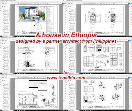
I did not made more sketches to impress customers hoping to convince them to pay, unless they offered to pay in advance. Taking payment in advance gave me obligation to satisfy customer, and some customers were so exigent asking many revisions and consuming me time valued higher than the price they were paying me. See Nigeria house I designed in 2016, the customer wasted 2 months instead of usual 1 week. Yes, TWO fucking months for ONE family house! Afterwards I rejected all projects, no matter if they were willing to pay in advance, telling them to hire another architect.
In 2017 and 2018 I have been contacted by several big companies looking to employ me for design jobs in ArchiCAD, Blender, Chief Architect, Revit, etc. There could have been companies looking to employ me in early years too, but they turned away for some reasons (they asked me “Do you use software X?” and I answered “No, I use AutoCAD” without realizing that they want to employ me, I could have said “I can learn new software if there is a business opportunity“). I came in conclusion that one of reasons for failure of my design business is that I stick on AutoCAD which is a bit outdated software.
Working for such company would guarantee a constant payment and in <2015 was a better option than working for ad-hoc customers who may not pay my services. However, they wanted full-time employment and most likely would have overloaded me with too much work, which as 2017 could not do due to my database projects, I can only work part-time and is questionable if the hourly pay is high enough compared with what I am currently earning from sale of databases.
2017 – outsourcing to other architects
After a year of hiatus I decided to outsource ALL architectural projects. Several architects offered to work for me “if I am too busy” but seeing their high experience and cheap prices made me ashamed to continue designing myself. When people contact me for architectural design services, I ask project requirements, confirm ability to pay an architect, ask for contact info, then I pass lead to most suitable architect to discuss project details and negotiate price, collect payment from customer and pay me 10-20% referral fee, or instruct customer to pay me and I pay architect 80-90%.
This was NOT successful either, when my architects contact customers, 75% never replied them, some insisted to have project done by myself and not third-party architects (even if they can do better job than me), and when customer reply, architect wants to get paid before making a sketch, customer wants to see a sketch before paying, they just waste time exchanging emails. Only FEW deals were completed successfully.
I contacted other architects who promote their services online, and figured out that all of them face same situation like me. They do not make any drawing for free, waste a lot of time replying emails and phone calls, quoting prices, to have 1 paying customer out of 10 people contacting them. Only architects who have a local office have higher conversion rate, and is normal to spend more than 1 month for a project, their earnings barely exceeding 2000 USD per month even after being in business for 20+ years. I am glad that I did NOT went to architecture university, I would have been a poor architect.
Conclusion: serious people who are PAYING usually engage a local architect who can meet face to face, to make official drawings, submit them to authorities, and also supervise construction (which I cannot do), while the people browsing internet and contacting me are usually people needing free ideas and unofficial drawings, thus the low ratio of paying customers.
Some people suggested me to get employed under an established architect. But again, do I am the right person for such job? If I haven’t done this in 2012-2015 I am NOT going to do today. The number of databases projects I started and responsibility to update them regularly prevent me from having another full-time job. But I am curious how stressful or profitable would have been such job, and how it does work in case employer do not let me in direct contact with customer and what happens if the customer request revisions?
Possible revival of “Virtual City” 3D graphic design artistic hobby
Since 2012 been focused on designing projects requested by actual customers, hoping they will pay me, instead of designing “virtual city” for hypothetical customers, as before. But if I were to design again as hobby, see what is new:
Late 2013, I decided to use decimal metric system for all projects including hobby ones, I remade all rules, bedrooms 3×4 m, 4-room being 90-100 sqm for normal projects, 60 sqm for low-cost ones suitable for Latin America, India or other third world countries, now I will indicate both gross and net floor areas to align with what most developers are doing.
April 2014, I changed representation of floor plans: instead of black background (AutoCAD default), I use gray background, and each room in different color (living room yellow, bedrooms orange, bathroom blue, etc). All lines which were 2-pixel wide are now 1-pixel wide, and I screenshot floor plans at 20 pixels per meter instead of 40 or 32 pixels per meter, so the proportion is similar, but lower resolution would discourage people to print floor plans and use them without my approval.
May 2014, I replaced my 17″ 1280×1024 monitor with a 24″ 1920×1200 one, by this way I researched screen resolution history, realizing that most screen resolution are multiply of 320 and only 1024×768 and 1366×768 are the exception, surprisingly these two were most popular screen resolutions. For a period I wanted to continue doing 3D render at 2048×1536 which is displayed at 50% size on the mainstream 1366×768 laptops, but in late 2014 I decided to do 3D renders in 1920×1080 (and 1440×1080 if project do not not require wide format).
Whenever I will have time to redesign my old projects or make new projects for artistic purposes, we will see…










can i also see the plan and design of ur “the childhood” design house
but in only a three storey.
and min. of 250 sq.m
thanks a lot.
more power. 🙂
-ian
That times I was drawing floorplans in Paint and 3D in AutoCAD… started using AutoCAD for floorplans only in late 2008. I can draw now floorplan “as it was imagined in 2002” but what is the point of this? Better, give me all requirements (primarily land length and width and number of rooms) so I can draw new, better floor plan.
i have a little bit idea for division
all of ur plans and design was so good
and trusted
in commercial(1st floor)
divide it by at least 5
with c.r.
the middle is open direct to stair
in office (2nd flr.)
normally office division.
more simplier much better.
in residential(3rd floor)
atleast 4 rooms or more
(its up to your design) also with c.r.
and a roof truss.
symnetrical or rectangular
much better.
thank you.
godbless.
So you’re asking if I HAVE = you’re looking to buy pre-made floor plans?
There’s IMPOSSIBLE to predict what customers come in and design in advance… I don’t HAVE because I never designed any office-residential mixed building, but I can DESIGN one now. Please clarify your requirements (land length and width and number of rooms for residential part, to see how many units can fit per floor, as I guess that 250 sqm should be footprint)
Do you need only floorplan as idea or also pay to design detailed construction drawings to be sent to contractors?
PS: was really necessary to leave 3 comments various website pages and a 4th one on facebook page, plus 5th private message on facebook? 1 comment on site was enough to notice you, and I invite you on live chat!
Dang it bro, i had been into CAD since late 90’s (ACAD 12 series) and only earned my keep doing tutorials.
I hail from the Philippines and there was a law there that prohibited us CAD Techs to make any Building Drawings unless you are a registered Architect (which i am not). But anyway, I had some paying customers who are registered Architects who have no inkling on CAD.
Anyway, if you are too overloaded with Architectural based projects, we might be able to help each other and pass me some of your projects (we could negotiate the price), not free of course). Email add is [email protected]
Best regards
Really? is there a law that you are not allowed to design buildings for hobby unless you are architect? This is why I got this comment to leave architecture business?
Regarding collaboration, YOU’RE WELCOME… but probably I can only hire you for people who pay me in advance, which are so few that I can do their job myself. But I may still need your help if I cannot do myself something. Are you able to make electrical and plumbing drawings?
I enjoy the efforts you have put in this, regards for all the great blog posts.
Work at home.
My name is Fred Tulia, Im from Papua New Guinea close to Australia, I very much would like to have partnership with your team,
Our country is the 3rd world country and theres so much high class level of building is taking place, they are only build by Australian company or New Zealand .. we need very much your valued service in PNG,
If you could design and build some of the best buildings, I believe we will target the market ,
I look forward to work more closer with your team
With kind regards
Fred Tulia
Email: [email protected]
Myself Sunil Mehtani Delhi based Vaastu Consultant. It will be my honor if I would get a chance to work with Your Team.
Do you design floor plans or complete set of architectural drawings, or just offer Vaastu consultation?
I have 16 years experiace in construction line, but now I just offer Vastu consultancy. My profile is https://www.askacharya.com/vastu/vastu-consultant-sunil-mehtani
Hi there Dear, are you genuinely visiting this site regularly,
if so then you will definitely take nice knowledge.
I’ve been inspired from viewing your posts, you’ve done really well.
Am a Nigerian studying Architecture here in Nigeria.
The New Generation- In Teoaldia
L- Shape Preferred clip edge for laundry rooms each floor or basement 2 laundry rooms 1-2-3 bed rooms add windows in bathrooms 1 and 1 and 1 1/2 baths Balcony’s outside living rooms carpet and tile flooring 10 units per floor Elevator’s two. Twin building attached 2 stair cases IV in event of traffic monitoring garbage removal /Garbage drops next to storage and utility rooms.Air Condition room.
Storage room 4 each floor Brick facing other exterior designs fine,entering the building with four entrances Garbage removal door supply room work shop.small office area. in depth roofing over one foot.
Check with the Little Sample series far corner. need any more information text 908-422-4901
1 hour before posting this comment you started conversation via LiveChat, I asked you project location and you did not answered anymore, and now i see you posting comments. Please message me again via LiveChat so we can continue conversation!
I need a detailed design of an architectural design building on a blot I will send you the measurements when you contact me at my email address above
Dear Sir / Madam,
Could we become the partnership for building construction in Papua New Guinea and in the Pacific Islands
I look forward to hear from you
With kind regards
Fred TULIA (Mr)
Dear Fred,
You have been emailed before and with no response. Kindly email me [email protected].
Regards,
RoyCG